Responsive Web Design: Create Stunning Sites in No Time!
Responsive Web Design (RWD) is a web development approach that ensures websites adapt seamlessly to various devices and screen sizes, providing an optimal user experience. This technique employs flexible grids, fluid images, and CSS media queries to create layouts that dynamically adjust based on the user's device, whether it be a desktop, tablet, or smartphone. By doing so, RWD enhances usability and accessibility, allowing users to navigate websites effortlessly across different platforms. As mobile internet usage continues to rise, implementing responsive design has become essential for businesses aiming to reach a broader audience and improve their search engine rankings.
 kimoyandex
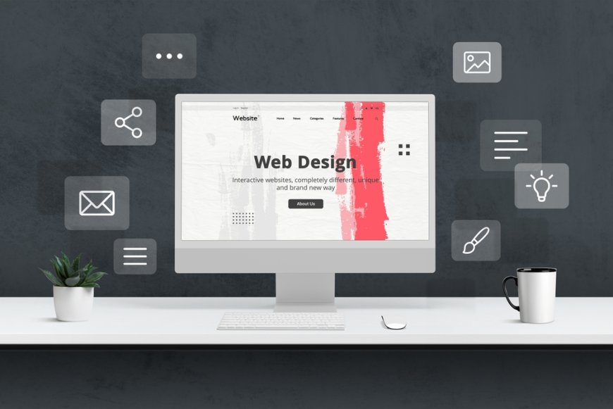

Responsive Web Design: Create Stunning Sites in No Time!
In today’s digital landscape, creating a visually appealing and functional website is more crucial than ever. As a web design enthusiast, I’ve witnessed firsthand how responsive web design has revolutionized the way we build and interact with websites. Gone are the days of static layouts that fail to adapt to various screen sizes; responsive design allows us to create stunning sites that look great on desktops, tablets, and smartphones alike. This approach not only enhances user experience but also boosts engagement and conversions. In this article, I will share insights and practical tips on how to harness the power of responsive web design, enabling you to craft visually compelling websites in no time. Whether you're a seasoned developer or a beginner eager to learn the ropes, you'll find valuable information that empowers you to create seamless, adaptable designs. Together, we’ll explore the essential principles of responsive design, the tools and frameworks that make the process more efficient, and best practices for testing and optimization. Join me on this journey to transform your web design skills and deliver exceptional experiences to your audience, regardless of the devices they use. Let’s dive in and unlock the potential of responsive web design!
I prioritize mobile-first design principles.
In today’s digital landscape, where mobile usage continues to soar, designing with a mobile-first approach has become essential. By focusing on small screens and touch interactions first, I ensure that the user experience is seamless across all devices. This strategy not only enhances usability but also forces me to prioritize content and functionality, stripping away unnecessary elements that can clutter the interface. As a result, I create intuitive designs that cater to the needs of users on the go, ultimately leading to higher engagement and satisfaction.
Adopting mobile-first design principles also allows me to anticipate and address the limitations of smaller screens right from the outset. By designing with constraints in mind, I can develop a more refined layout that adapts elegantly as the screen size increases. This progressive enhancement approach not only optimizes performance but also ensures that accessibility is a core consideration throughout the design process. In the end, prioritizing mobile-first design fosters a more cohesive experience that resonates with users, regardless of how they access the content.
I choose flexible grid layouts.
Incorporating flexible grid layouts into my designs provides a foundational structure that enhances responsiveness and adaptability. By utilizing a fluid grid system, I can ensure that elements within the layout adjust seamlessly to different screen sizes and orientations. This flexibility allows me to prioritize content hierarchy and visual balance, creating a dynamic user experience that remains consistent across devices. As I build these layouts, I often leverage relative units like percentages or ems instead of fixed units, which ensures that my designs scale naturally without compromising aesthetics or functionality.
Moreover, a flexible grid layout empowers me to create a harmonious relationship between images, text, and interactive elements. This balance is essential, particularly in responsive web design, where real estate is limited on smaller screens. By strategically placing content within the grid, I can guide users through a logical flow of information, making navigation intuitive and engaging. Ultimately, this approach not only enhances usability but also supports the overall aesthetic of the site, leading to a cohesive and visually appealing experience for every user, regardless of how they access the content.
I incorporate responsive images effortlessly.
In my approach to image incorporation, I prioritize the use of responsive techniques that adapt seamlessly across various devices, ensuring an optimal viewing experience. By utilizing the HTML <picture> element and the srcset attribute, I can deliver different image resolutions based on the user's device characteristics, such as screen size and resolution. This not only enhances loading times by serving appropriately sized images but also maintains image quality, which is crucial for visually driven content.
Additionally, I often employ CSS techniques like object-fit to ensure that images maintain their aspect ratios while fitting within their designated spaces. This attention to detail allows me to create visually appealing layouts where images enrich the overall design rather than detract from it. By prioritizing responsiveness in my imaging strategy, I contribute to a more engaging and accessible web experience for users, regardless of the device they choose to use.
I utilize CSS media queries effectively.
In my design process, I make strategic use of CSS media queries to tailor styles based on specific device characteristics, such as screen width, height, and orientation. By defining breakpoints, I ensure that my layouts adapt fluidly, transforming from desktop to mobile experiences without compromising usability or aesthetics. This means adjusting not only the size and arrangement of elements but also the typography and color schemes to suit various contexts, which ultimately enhances readability and user engagement.
Moreover, I find that media queries empower me to implement conditional styling that optimizes performance across devices. For example, I can hide certain elements on smaller screens or adjust padding and margins to create a more cohesive look. This level of customization not only strengthens the visual hierarchy but also improves navigation, ensuring that users can interact with content effectively, regardless of how they access it. Through thoughtful application of media queries, I strive to create a consistent and enjoyable user experience that resonates with a diverse audience.
I ensure fast loading times.
Fast loading times are crucial in enhancing the overall user experience, and I prioritize this aspect in every project I undertake. By optimizing images and leveraging modern file formats, I reduce the size of media while maintaining quality. I also utilize techniques such as lazy loading, which postpones the loading of images and videos until they are needed, thereby decreasing initial load times and improving performance on mobile devices with slower connections.
Furthermore, I implement efficient coding practices, such as minifying CSS and JavaScript files, to streamline the amount of data that needs to be processed. By combining and compressing resources, I create a lighter payload for browsers to download, contributing to a faster and more responsive site. Regularly monitoring and analyzing site speed with tools like Google PageSpeed Insights allows me to identify potential bottlenecks and make data-driven decisions to enhance efficiency, ensuring that users enjoy quick access to content without unnecessary delays.
I test across various devices.
In my approach to web development, thorough testing across various devices is essential to ensure that every user has a seamless experience. I make it a point to review how a site performs on smartphones, tablets, and desktops, recognizing that each platform presents unique challenges and opportunities. This process involves checking responsiveness, usability, and visual consistency to confirm that the design adapts gracefully regardless of screen size.
To achieve this, I utilize both emulators and real devices, allowing me to catch discrepancies in layout and functionality that might otherwise be overlooked. I pay close attention to touch interactions on mobile devices, ensuring that buttons are appropriately sized and that navigation is intuitive. Additionally, I assess performance metrics across different network conditions to verify that load times and interactivity remain optimal. By embracing this comprehensive testing strategy, I can confidently deliver a polished product that meets the varied needs of all users.
I simplify navigation for users.
Clarity and ease of navigation are paramount in my design philosophy. I focus on creating intuitive pathways that guide users to their desired content without unnecessary distractions. By employing straightforward menu structures and clear calls to action, I ensure that users can quickly understand how to navigate the site. This approach not only enhances user experience but also reduces frustration, allowing visitors to engage more deeply with the content.
I also prioritize the hierarchy of information, making certain that essential elements stand out while maintaining a cohesive flow throughout the site. Utilizing visual cues and consistent design patterns helps users anticipate where to find information. Additionally, I incorporate feedback mechanisms, such as hover effects and active states, which afford users a sense of control and direction as they interact with the interface. Through these strategies, I strive to create a navigation experience that feels natural and efficient, ultimately leading to higher satisfaction and engagement levels.
I focus on user experience.
In my design process, I pay close attention to how users interact with the interface, always considering their needs and behaviors. By conducting user research and testing, I can gather valuable insights that inform my decisions. This user-centered approach allows me to tailor features and functionalities in a way that resonates with the target audience, ensuring that the final product is not just visually appealing but also highly functional. I believe that understanding the user's journey is essential in crafting experiences that foster engagement and satisfaction.
Furthermore, I make a conscious effort to incorporate accessibility standards into my designs. This commitment ensures that all users, regardless of their abilities, can navigate and interact with the website effectively. By using appropriate color contrasts, legible typography, and providing alternative text for images, I promote inclusivity. The goal is to create an environment where every user feels welcomed and empowered to explore the content, ultimately leading to a richer, more rewarding experience that keeps them coming back.
I leverage modern web frameworks.
Modern web frameworks play a crucial role in enhancing my development process and the overall performance of the sites I create. Utilizing these frameworks allows me to build responsive and dynamic applications efficiently, leveraging pre-built components and libraries that streamline the workflow. I appreciate how frameworks like React, Angular, or Vue.js enable me to create interactive user interfaces that adapt seamlessly across devices, ensuring an optimal experience whether a user is on a smartphone, tablet, or desktop.
Moreover, by leveraging these technologies, I can implement best practices for code maintainability and scalability. The modular nature of these frameworks encourages clean code organization, making it easier to manage and update projects over time. This not only enhances collaboration with other developers but also accelerates the development cycle, allowing me to focus on refining the user experience and delivering high-quality products that align with contemporary web standards.
I stay updated on trends.
Staying informed about the latest trends in web design and development is essential for maintaining a competitive edge in the industry. I regularly engage with various resources, including blogs, podcasts, and online communities, which provide insights into emerging technologies and design philosophies. This commitment to continuous learning enables me to experiment with innovative techniques and incorporate them into my projects, ensuring that my work remains relevant and appealing to users.
Additionally, by attending workshops and conferences, I can network with other professionals and share best practices, gaining fresh perspectives that enhance my approach to web design. Keeping an eye on design trends allows me to adapt to changing user expectations and industry standards, ensuring that my creations are not only visually stunning but also functionally robust. This proactive approach empowers me to push the boundaries of my work and deliver solutions that resonate with modern audiences.
In conclusion, my journey into responsive web design has been both enlightening and rewarding. I've discovered that with the right tools and techniques, creating stunning, adaptable websites doesn't have to be a daunting task. By prioritizing flexibility and user experience, I can craft sites that not only look great on any device but also engage visitors effectively. As I continue to refine my skills and keep up with industry trends, I am excited about the endless possibilities that responsive design offers for enhancing online presence and making a lasting impact. Whether you're a seasoned developer or just starting out.